Conversion optimisation for MobiMatter
Improving the MobiMatter user journey across two pages, the landing page and the package detail page, for understanding, trust, and conversion.
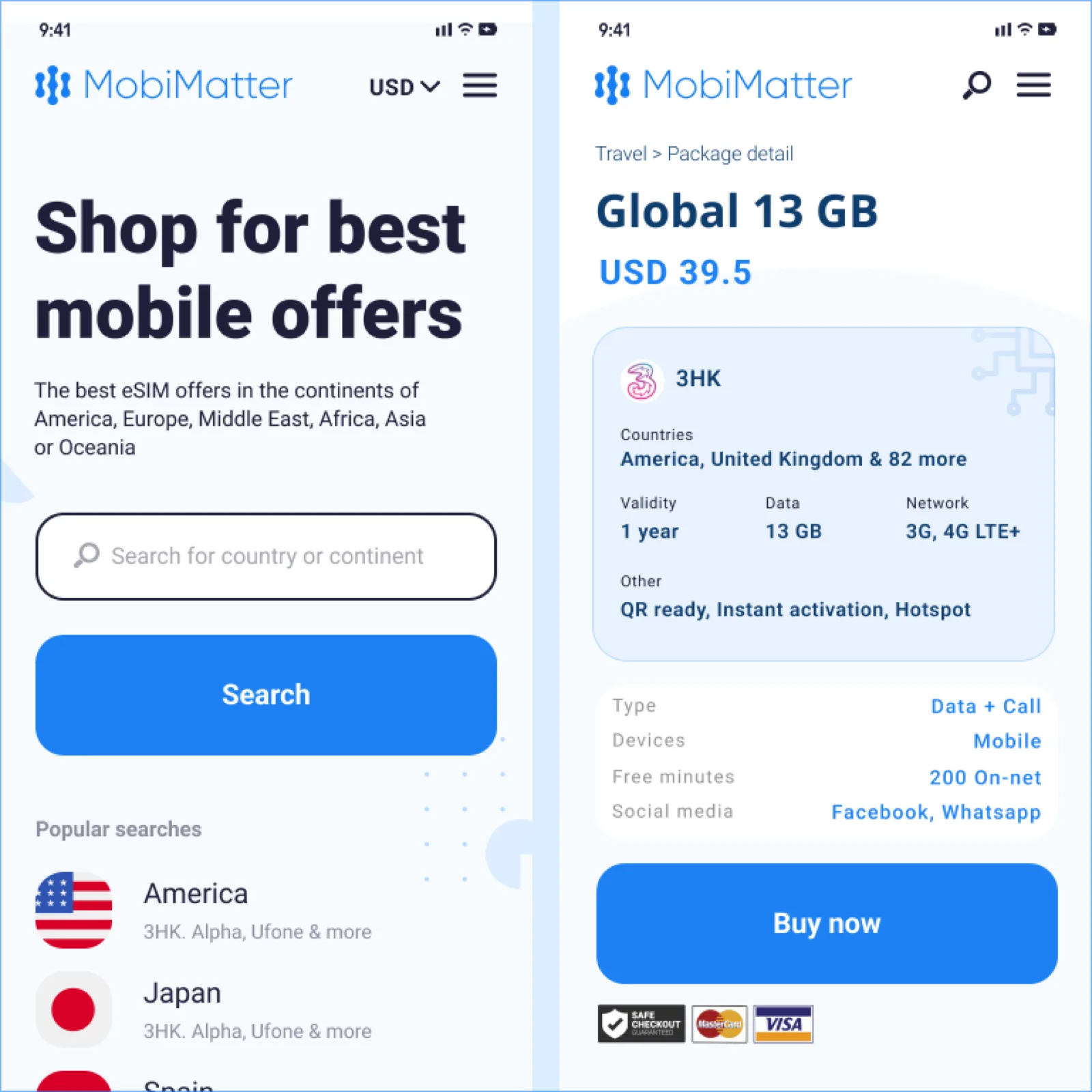
Summary
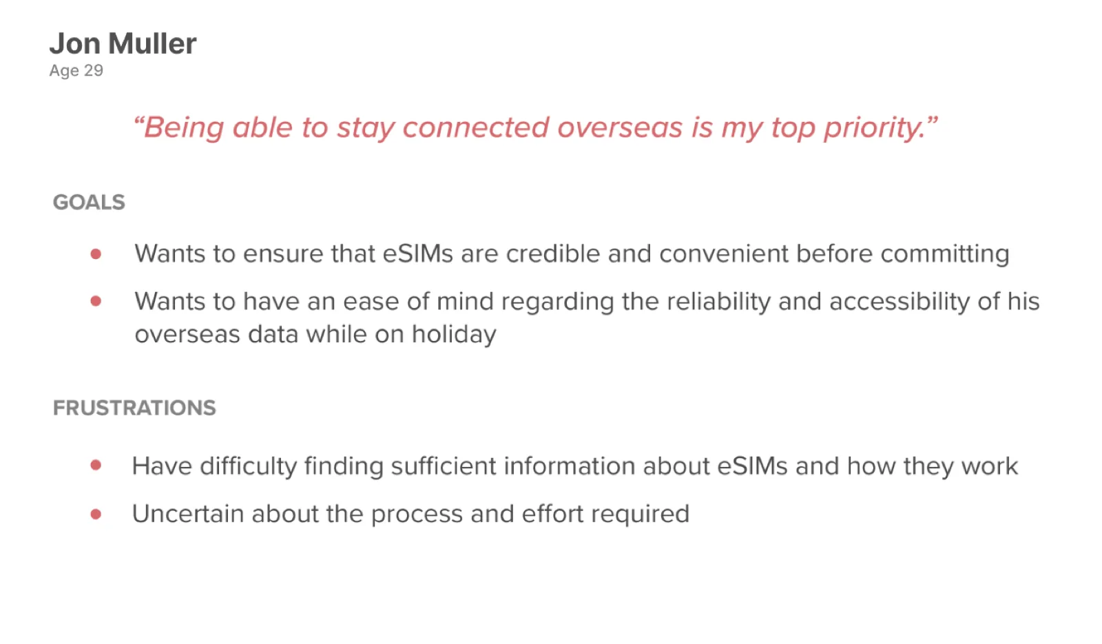
At MobiMatter, we wanted to improve the user journey for our customers. We found two main touchpoints that needed work: the landing page and the package detail page.
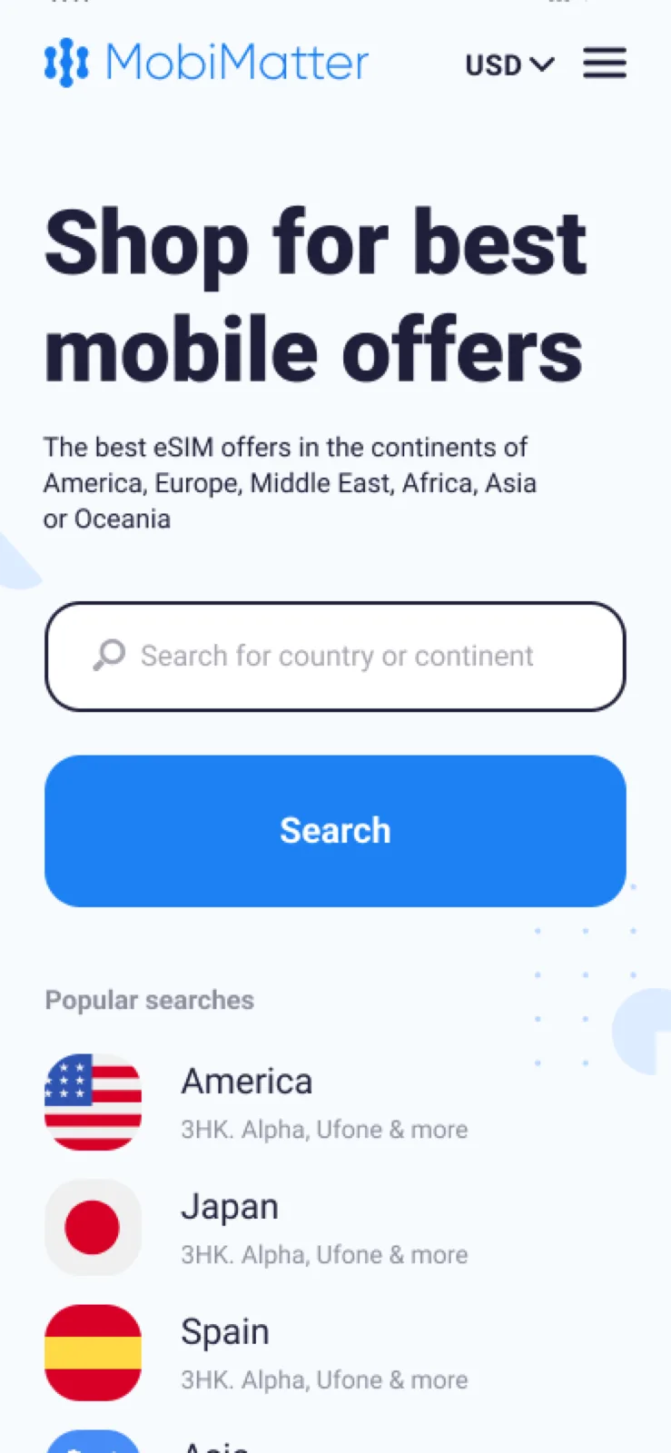
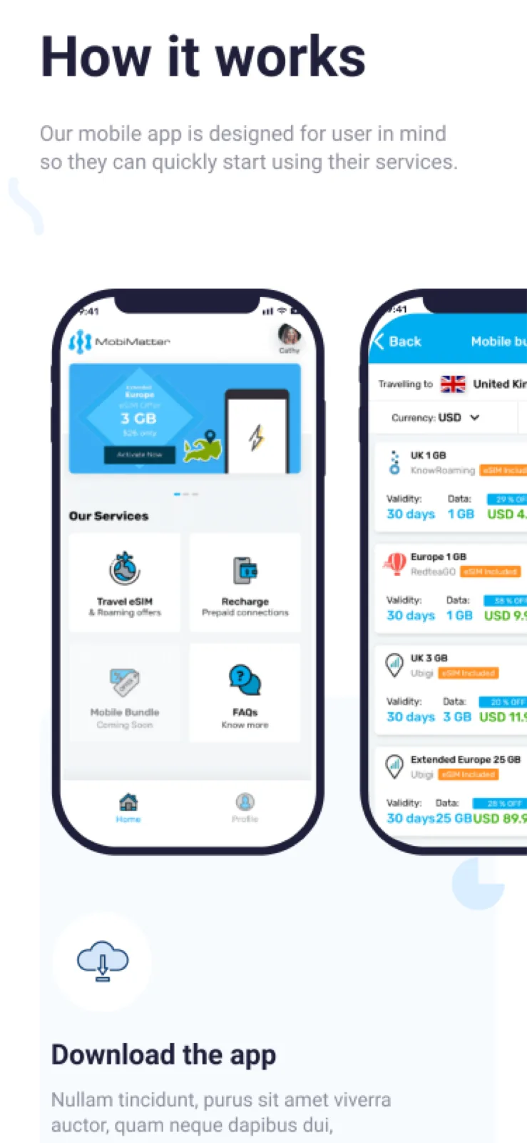
The landing page had a large drop-off. Users didn't understand the service, and the design didn't excite them. We fixed this by adding sections like "how it works," "why us," "testimonials," and "partner badges," and by revamping the visuals. We also improved search and the navigation structure to make the experience simpler.
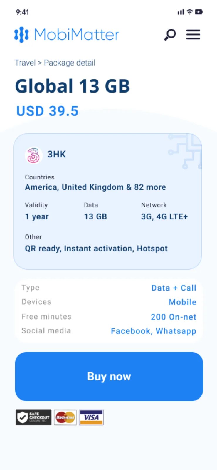
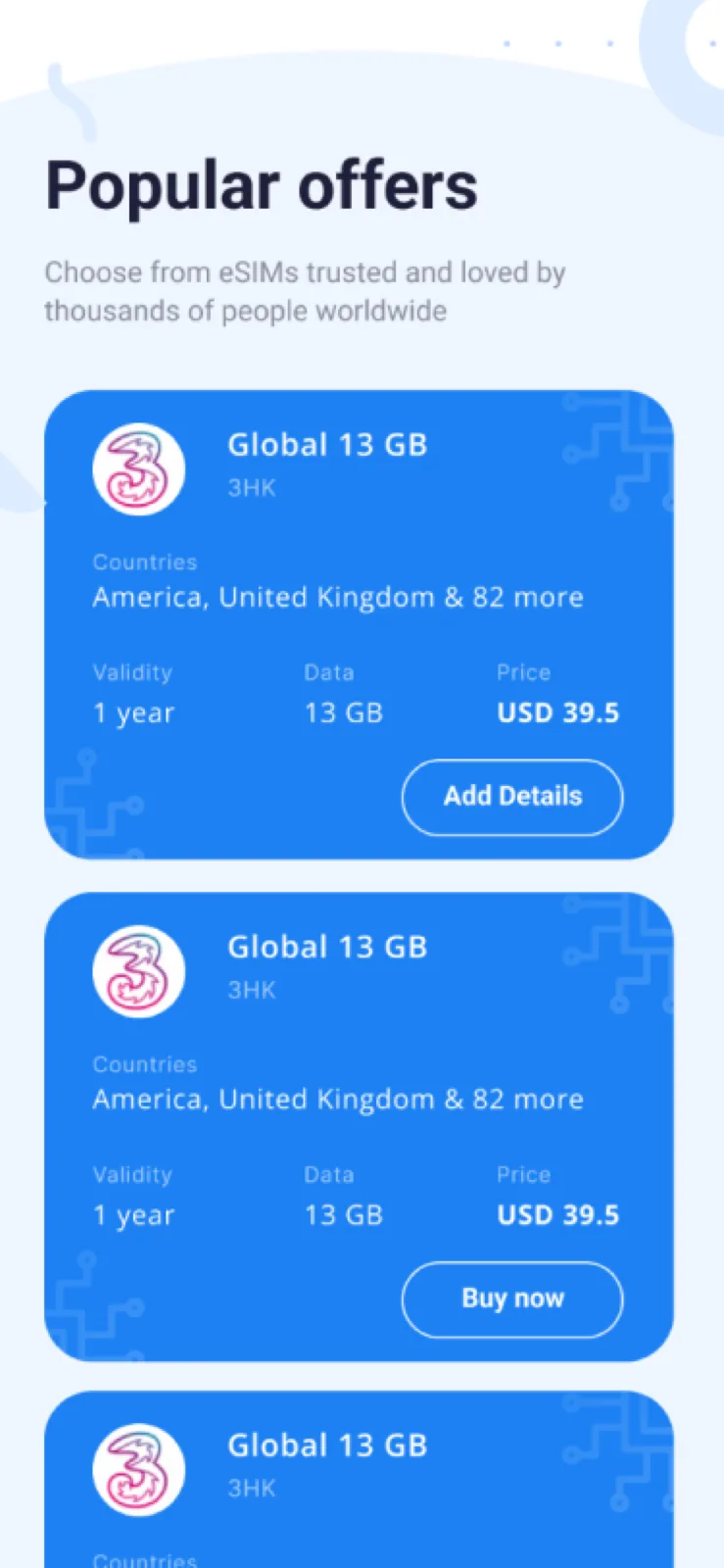
On the second touchpoint, the package detail page didn't have the right content structure, which hurt retention and conversion. Once a user decided not to take an offer, they didn't know where to go next. We fixed this by improving the content and CTA structure and adding a "related offers" section to explore.
During testing and validation, we recorded a 10% conversion-rate improvement through the purchase journey. That was a real lift, and it showed the value of the work.
Overview
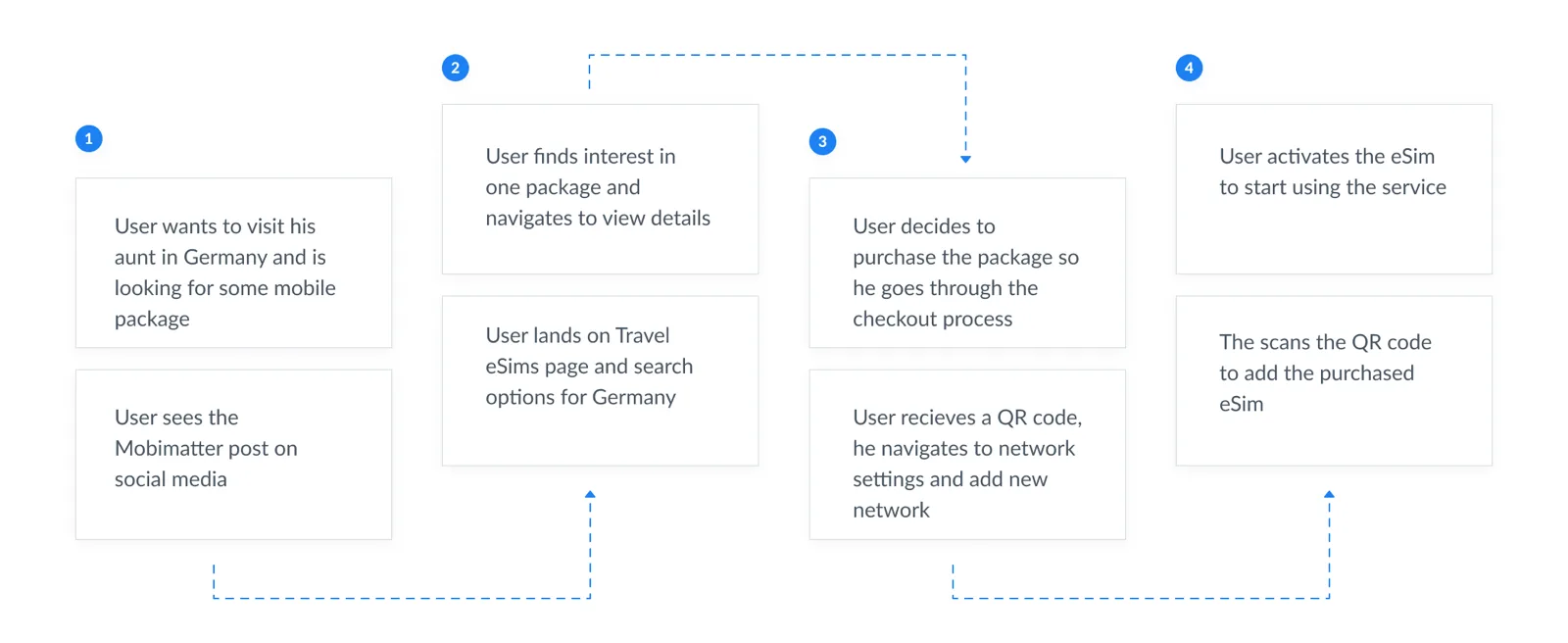
MobiMatter is an online re-seller and distributor of mobile telecom services, providing packages that are best-priced and tailored for user needs. The goal of this exercise was to improve two main touchpoints in the user journey: the landing page (entered from social media) and the package detail page before purchase.
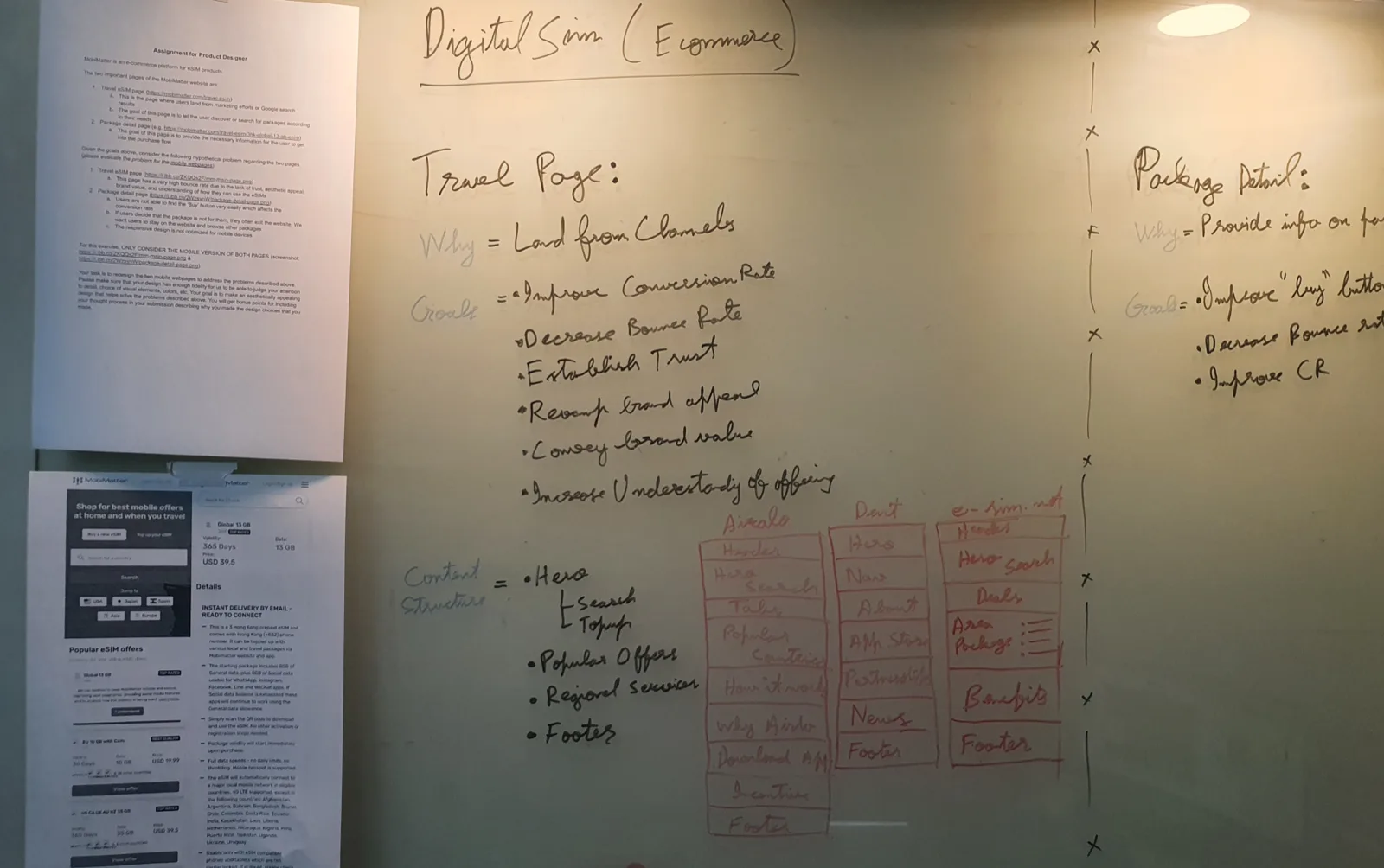
Understanding the existing system
Competitor research
I ran a quick competitor analysis (Airalo, Dent, e-sim.net) to understand the market and similar solutions: their offering, content structure, design language, UX alignment, and depth of features.
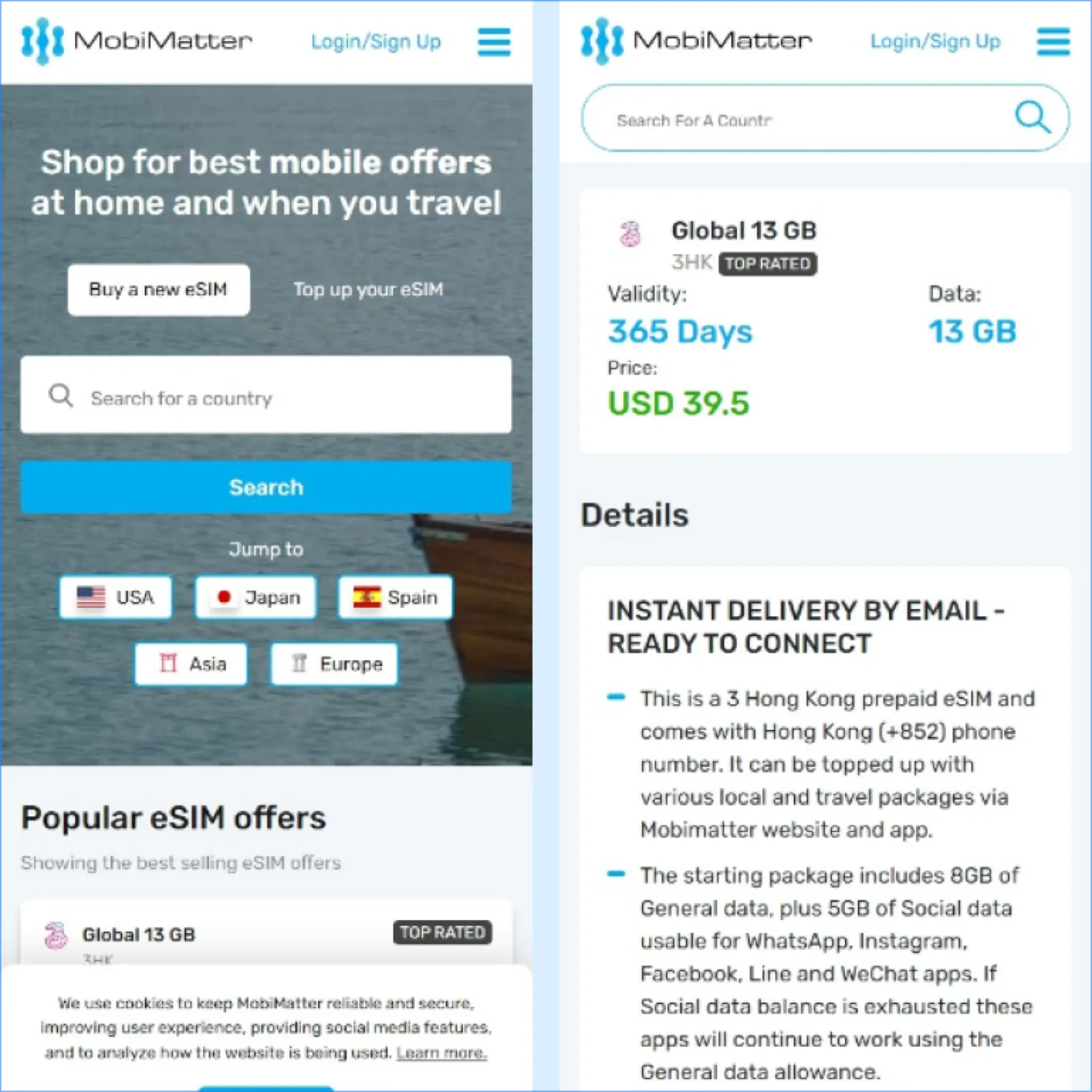
Evaluating the existing landing page
We need this page to provide information about our services, features, and mobile apps; users land here from social media to learn the value proposition. The goal is to help users find interest, understand and trust the brand, and navigate to purchase packages.
- Unclear tabs functionality in the hero search area.
- Multiple conversion goals on one page impacting conversion for all of them.
- UX copy should be more user-friendly to help users learn and use the interface.
- Design components inconsistent with the design-system conventions.
- Header navigation should be simplified to improve site structure.
- Introduce sections like "how it works," partners, and "why us" to convey value and credibility.
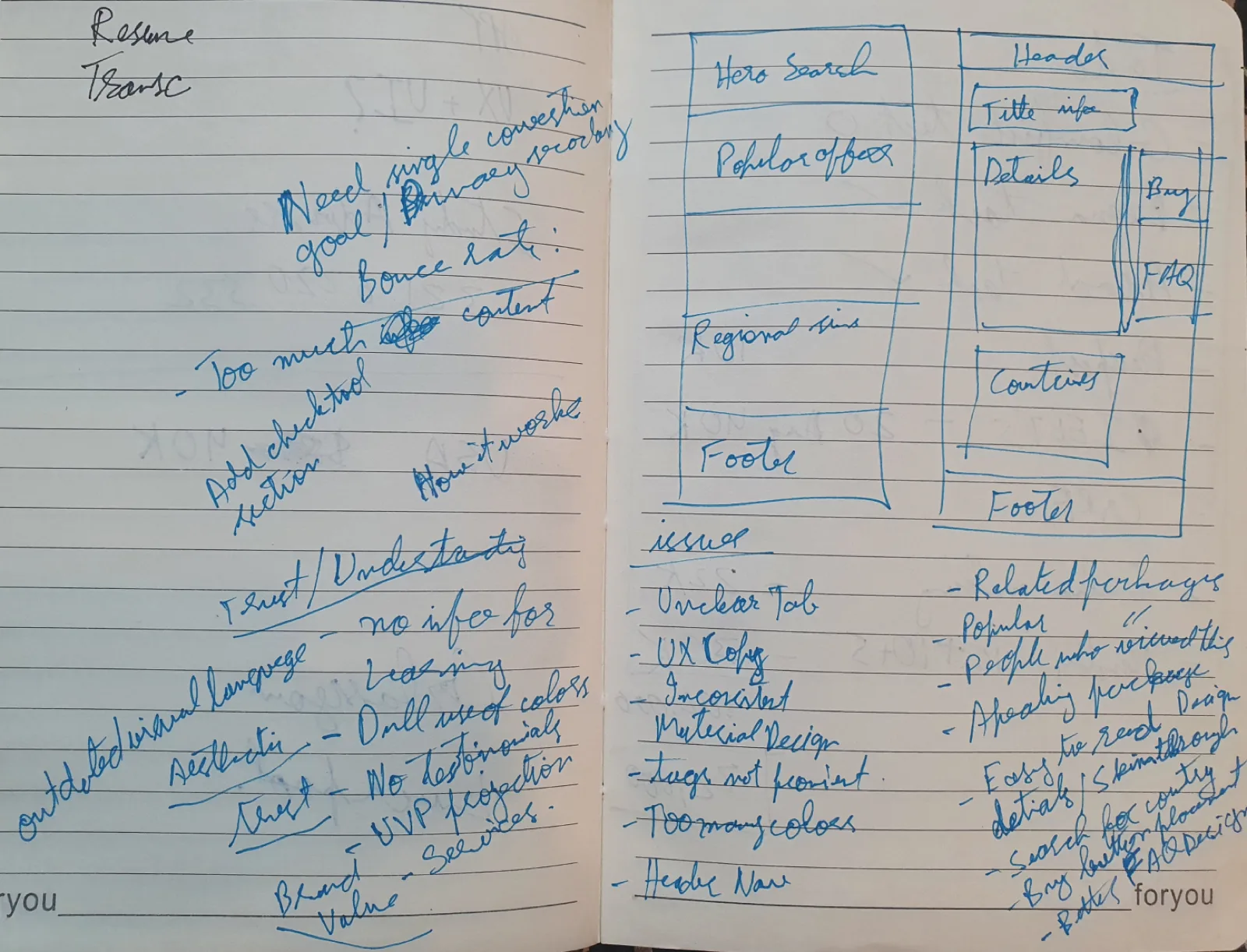
Evaluating the eSIM detail page
The user's mental model here is standard e-commerce. The user wants to know more about the product once interested, so we provide easily findable, relevant information to help them decide and purchase; the goal is to help users commit to an offer and start checkout.
- Package title design needs to improve to attract users.
- Card content and important package information should be skimmable, not heavily reliant on reading.
- Introduce sections like "similar offers" or "popular offers" to help users explore.
- Contextual search in the "works in" section to help users quickly find their desired location.
- Secure-transaction and payment badges to increase trust and help users feel secure.
- FAQs should be up-front, not hidden in an expandable component.
Designing the new system
Wireframes
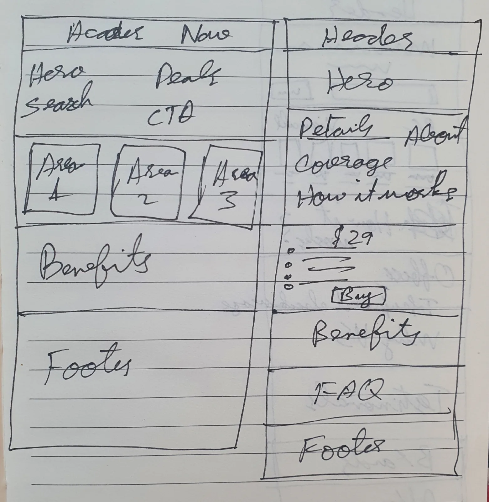
With insight from competitor analysis and the evaluation of the existing interface, I ideated various ideas to find the best ones, then refined the wireframes and increased their fidelity.
Interface design
I used a modern, minimal, mobile-first approach. I flattened the branding to match the style, improved design consistency, and used a match of real images and vector-based communication.